Crypto Tax Calculator
Uplifting the mobile experience
01 - Problem
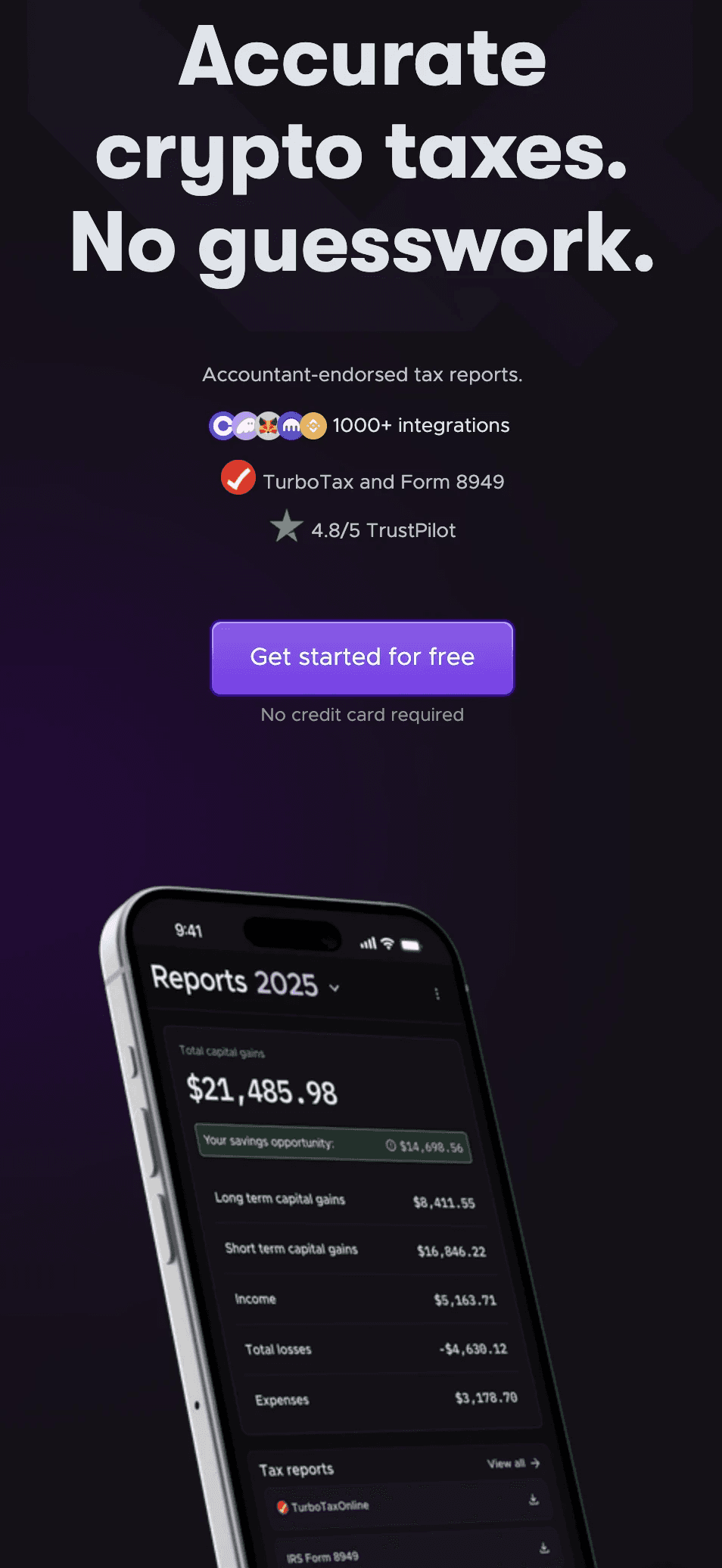
Following a strategic partnership with Coinbase, we saw a massive influx of new users, with 60% of referrals arriving via mobile. However, our mobile experience wasn't optimized for this scale. An underwhelming UX led to significant friction and high churn rates at critical stages of the onboarding funnel.
02 - The Audit: "It Wasn't Pretty"
Before diving into solutions, I conducted a full UX audit that identified several critical friction points:
Janky and laggy experience
Users faced 1-2 second delays on taps, making the interface feel non-robust.
Information overload:
Pages were cluttered with "too much content" and unnecessary warnings that overwhelmed users.
Poor mobile patterns
Heavy reliance on horizontal scrolling and cluttered filter sections that "suck on mobile".
Hidden primary actions:
Critical buttons were not prominent enough, and layout hierarchy was unclear, especially on the Reports page
03 - Design principles
To guide the uplift, I established three core principles focused on mobile-first comprehension:
- Progressive disclosure
End to end usability testing on the existing experience to establish a benchmark and discover the 'why' behind key drop of points
- Optimise for scannability
Prioritizing the most useful information to improve user comprehension at a glance
- Mobile familiarity
Mobile Familiarity: Utilizing common mobile patterns, such as the iOS-style "sheet" component, to reduce cognitive load.
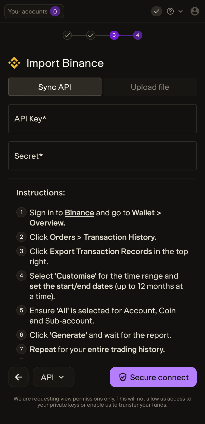
Connecting Binance by API

Transaction table
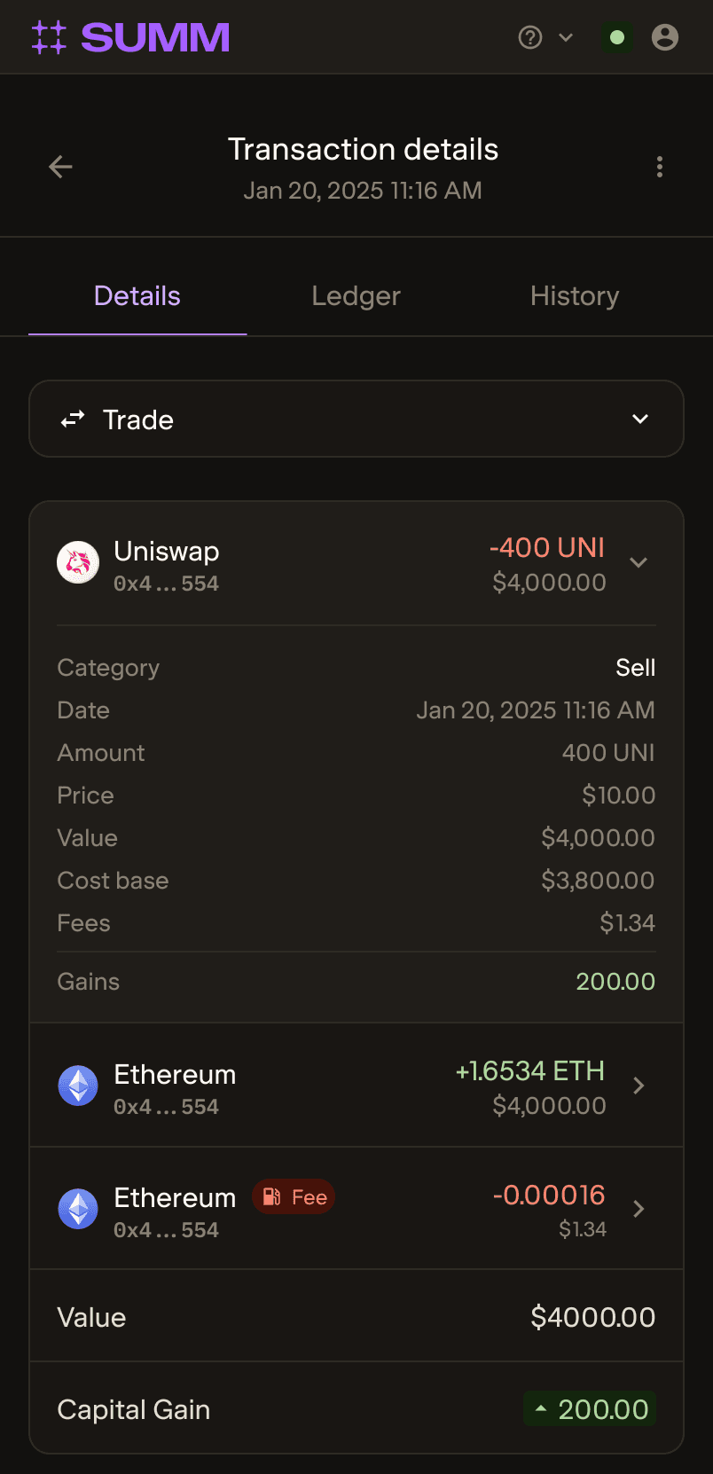
Transaction breakdown
Landing on portfolio post onboarding
Viewing transactions
Browsing the plans page
03 - Impact
The optimisations led to significant, measurable growth across the entire product funnel.
Onboarding
+50.76% Increase in conversion rate
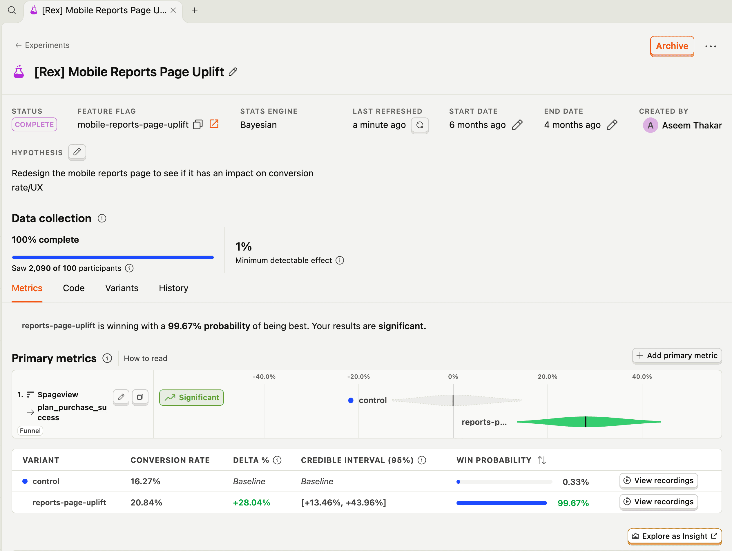
Reports page
+28.04% increase in covrsion rate